Cibo Market is a grocery delivery app that I designed for Canada Produce. I was given a project brief and a task to complete daily while working with the project managers and front-end developers. At the end of a week, I had basic outlines of the online grocery delivery app. Later after I designed the outlines of the application, I decided to change and refine my designs of the produce delivery app, which I believe could better serve the users.
Duration: 1 month
Methods: Customer Journey Mapping, Solution Sketching, Wireframing, UI Design, UX Design
Tools: Figma
How can we make grocery getting easier and enjoyable for busy people?
Our user needs a way to get produce delivered to their home. She wants to be able to drive and pick up her order, and wants to spend as little time as possible waiting at the supermarket.
Throughout the twelve months, I focused on creating a web app for Cibo Market. In the beginning of the project, I thought it would be interesting to design a platform for the produce ordering service. I conducted some additional research and made some changes to the tasks that I had completed in project.
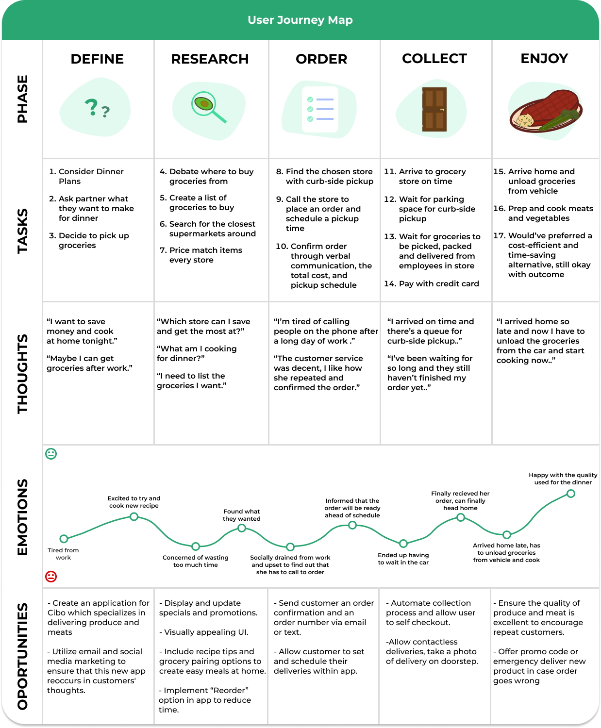
To start off this solo project, I decided to create a customer journey map to better understand my user and inform my design process. To do this, I interviewed a few friends with a series of questions to ask how they commonly bought their groceries and how they felt about it. Predictably, many still rushed around their local supermarket with carts because these stores weren’t on existing produce delivery platforms, but they would prefer being able to order online. I decided to incorporate this into my user journey.
Once I had a clearer idea of the problem, I ideated how success would be measured. To do this, I applied modern UX principals and I used a combination of Google’s HEART framework as well as the Goals-Signals-Metrics (GSM) process to ensure a shared understanding of what success looks like with my employers.
Shortly after, I began to ideate potential solutions to our users problem. First, I spent some time researching existing websites and products within the produce industry and I reviewed their existing problems and solutions. Next, I took some time in creating 8 rough sketches with the goal to push beyond my existing ideas.
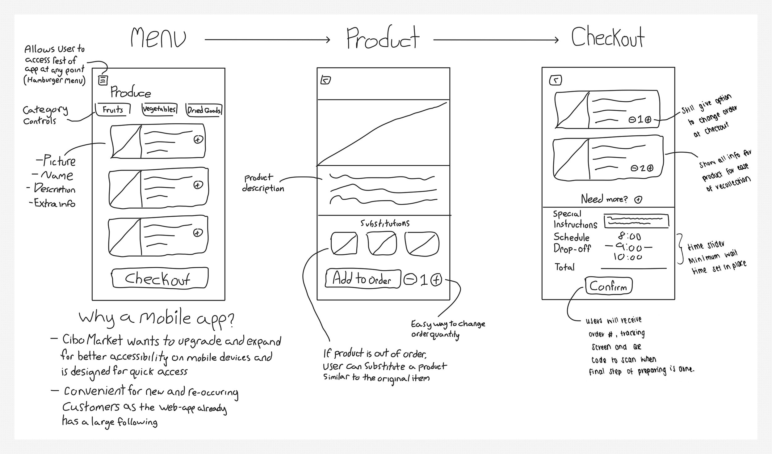
My next task was about focusing and refining some ideas created in the crazy 8’s session. I chose to dive deeper into three screens that I believed were most important to demonstrate the user’s journey - namely a list of produce the company provides, products and checkout. I chose to keep these sketches low fidelity with additional annotations on the side. I wanted to focus less on the visuals and more about using this as a communication tool that could be shared with stakeholders.
When I finished designing the solution sketches, I focused on creating more detailed wireframes that would convey my ideas more clearly. I kept my designs minimal and consistent, and made use of grids and hierarchy guidelines to help where I put everything on my screens.
On the final stretch, I focused on UI design elements for my remaining screens. I added minimal, high quality images that had ample whitespace for promotional text, and added colour. I made use of a vibrant green that is commonly associated with triggering healthy and organic aspects of the produce and products the company offers, which makes for attention-grabbing branding and follows the color scheme and pattern of the company.
At the end of my prototype, I have revised my product solution to the grocery delivery app. From here, I would like to dive deeper into creating a seamless and easily understandable tracking process for users to follow their order.
Thanks for viewing my work!
If you have any feedback, want to collaborate or just want to say hello, let’s get in touch!


